CROSSPOST: This article was originally posted as part of PerfPlanet Calendar 2016 on December 7th, 2016
Speed needs to be designed
Speed of User Experience (UX) is important for your web sites and mobile applications, but it often takes a back seat to functional improvements and is always thought of as purely technical exercise – proactive at best, but more commonly coming after a newly released product fails to perform.
While technology plays a big role in delivery and rendering of user experiences in modern applications that depend heavily on networks and on-demand content and functionality, it only provides solutions and often has serious constraints.
In order to create products that deliver great experience, it is critical to start designing speed and planning on how it can be delivered at the very early stages of the process.
Movies or paintings?
Unfortunately, today’s deliverables that are passed from product people to designers and from designers over to development teams are inherently static.
Both early product wireframes and more elaborate Photoshop (or Sketch) comps/mockups only depict the final view of the user experience and do not articulate the inherently progressive nature of web medium.
In his talk, Speed vs. Fluency at Velocity New York 2015, Kent Alstadt asks if today’s web designers are more like film makers who direct “short films” of digital experience or if they are artists who paint beautiful oil paintings that show final picture. He argues that human’s brains enjoy experiences with higher “processing fluency” and web pages that are designed/directed to achieve it would be more effective in meeting their goals.
Performance Choreography
Tim Kadlec in his WebPerfDays NY 2014 talk about Performance Choreography also draws parallels with movie making and cartoon animation where transitions and “in-between moments” are given a lot of thought as they heavily impact perception.
He points out the importance of concentrating on techniques like skeletal designs that focus on progress instead of using spinners and other artificial progress indicators that emphasize waiting.
Revealing Features
In order to achieve a smooth transition between different views/pages of our interface it is critical to concentrate design thought on this transition.
It’s important to ensure that the sequence in which features are revealed to the user is natural and follows user’s incremental needs as they wait comfortably for all the information and interactive functionality to be shown.
Rendering Stages
The whole universe of views and pages is very diverse and unifying all the experiences is impossible. What we can do instead is concentrate on user’s needs as they experience information in human-computer interaction on the web.
If we step back from specifics of individual pages and experiences and look at the wider problem, we can group rendering into several important stages.
Identifying these stages for their digital experience would help product and design teams come up with appropriate visual solutions and create smooth transitions.
1. Verify Destination
First step of any web navigation from one page to another or interaction within website interface is to assure the user that the action they performed was the one they intended to do so they can comfortably wait while it loads without wondering if they need to click the Back button.
This applies equally well to navigation from a search engine results page or external listing page where a link to a competitor’s site can be right next to your own as well as navigation within your own site with many alternative navigation paths.
If the user is waiting too long for any piece of interface to show, they can cancel their action out of sheer frustration and leave. This means that we need to identify the minimum amount of User Interface that we need to load as quickly as possible to reduce the uncertainty and to keep them interested.
Here are the most common UI components that are relatively easy to quickly show to the user:
- Core branding elements like logo and brand colors as part of top navigation
- Breadcrumbs and page headline/title for specific detail pages

2. Provide Primary Content
After the immediate feedback was provided, it is most critical to show the user the primary content we intend them to experience.
One challenge that we have here however is to separate core, primary pieces of content on the page from all content that we’d like to provide.
It’s important to narrow down the set of components so they can be loaded as quickly as possible and users can immerse themselves into content while waiting for the full experience to load.
Primary content is usually easy to identify in today’s design process because it is naturally given the most attention in product conversations and has the most prominent place on the pages.
Here are a few examples:
- Leaderboards/hero images on marketing pages and the home page of the site
- Article text & photo for the news articles
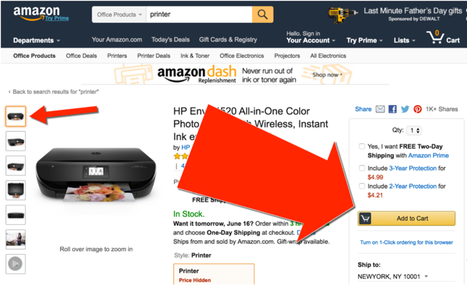
- Product title & image on e-commerce product detail pages
3. Allow Interaction
Usually, the most important part of user experience on the web is user’s action; almost all design concentrates around soliciting an action from the user.
It is critical to show points of interactivity to the user as soon as the primary content is shown and the user was able to make a decision to act upon it.
Calls to action (CTA) are quite different from business to business: “Add to cart” buttons for e-commerce or “Play” button on a video player are good examples.
Keep in mind that even though an action is probably the most important goal of each page, it cannot be performed until the user consumes the content to convince themselves to perform such action.
Same as in primary content, it is critical to ensure that primary actions are prioritized and included in this stage as we all have great temptation to put everything we, as builders of the UI, envisioned and you will have many opinions in the room with various product stakeholders.
Good news again is that business teams probably have a great grasp on what the primary actions are and they spend plenty of time in those conversations so it’s relatively easy to identify and isolate those components during the design phase.
4. Show Secondary Content
There is always something other than primary content and actions on the page, find this content and secondary CTAs and load them early in case the user is not interested in primary ones.
It is somewhat harder to do that as one can argue that everything that is not primary goes into this secondary category, but it is important not to lump everything into this group and leave things that are not as important to load in the next stage.
Good examples of secondary content and calls to action include:
- Sidebars, secondary headlines or content blocks
- Additional navigation
- User-generated content, sharing buttons, ads
5. The Rest & Invisible Tasks
Once you’re done identifying the first 4 stages, you are left with many other parts of the content and listing them would help you ensure that you don’t have any unaccounted items and avoid the desire to add any of them to the earlier stages.
There are always elements that are there for some political or legal reasons, like majority of footer content, for example, as well as interactions that you don’t have any business owner for and are slowly dying out, but you still don’t want to remove (you probably should).
This stage/group is also for elements that are not within user’s viewport and cannot be viewed or interacted with simply because they are literally invisible.
This applies to elements “below the fold” on search results pages that are already a consideration for “lazy-loading” or “post-loading” after initial page is rendered, especially if interface calls for “infinite scroll” or some other interaction that requires unbounded amount of data to be loaded over the network.
One particularly tricky category of element to identify as part of this stage are subsequent slides for the “carousel” widget that are not visible initially, but are shown either automatically after period of time or upon user interaction. It is very important not to prioritize these as they are often quite heavy and require significant amount of code and page manipulation and will delay more important components.
In addition to elements that are visible later, it is important to include all elements that are never visible, like analytics beacons or other tracking software. Luckily it’s already rarely discussed during design sessions so listing them here can be left for this last step, just don’t forget about those non-visual requirements that still warrant code download.
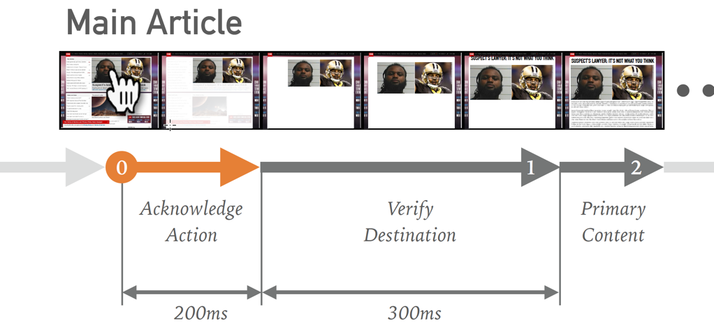
6. Acknowledge Action
This stage is the last, or the first, in the whole human-computer interaction model depending on how you cut the user path into distinct chunks we call pages or views.
In default page-to-page interaction users just wait until the page starts to load and only get first clue that they did successfully perform an action after viewport is cleared and replaced with next page.
Sometimes it is very hard to speed up these processes as heavy network operations happen at this point and complex server actions might also take significant time (e.g. calculating search results for an arbitrary query over large dataset).
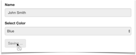
What we can do to give the user an acknowledgement of their action is to provide visual feedback. Historically first examples included disabling form elements upon form submission (reducing double-submission).
More creative ways were discovered over the years, including the following:
- Providing “loading…” label on the form or next to submit button
- Transition overlays spelling out that user’s acction is accepted and app is hard at work to perform it
- Erasing content area of the current page emulating next page’s initial render before request even went through to the server
- Animating-away the current view while next one is rendered
- Rendering skeletal layout of the next view within single-page app
This is only possible for interactions that are initiated when user is already on your site, but can provide a good flow once user is already engaged.
IMPORTANT NOTE: Please avoid using spinners and design good progress indicators that feel natural and don’t require users to concentrate attention on interpreting them.
Progressive Storyboards
When you include this work within your product design process, it is only natural to start thinking about how to adjust the established deliverables to better represent the results.
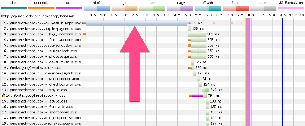
You can start by simply isolating the components of the “final” mockups that are currently used as deliverable and producing a sequence of views by simply whiting out the elements of the original mockup that are not supposed to be represented at particular stage of rendering.
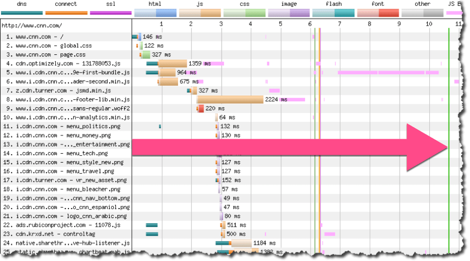
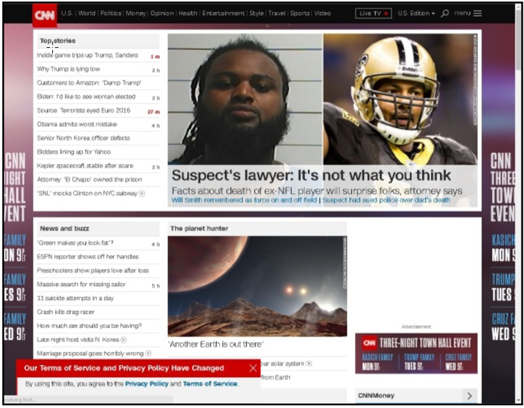
Here’s an example for a CNN Home Page (screenshot of final view):
And corresponding sequence of rendering stages depicting identified steps as a Progressive Storyboard:
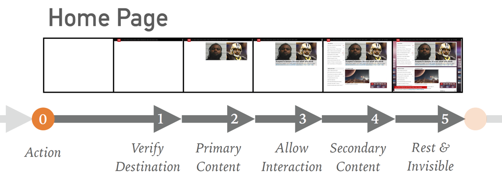
You can also go into more detail for more complicated transitions acknowledging user’s actions, as they are in your full control and can significantly help mask slow server-side and network performance.
Having these deliverables as a result of product design work can help the tasks of graphical design, animation and development teams; clearly stating expectations and making it clear what needs to be achieved.
Establishing Technical Constraints
Performance work can never be done by one team in isolation, it is always a collaboration between product and design teams who know the experience they try to create and technical implementation and operations teams who know technical realities of web medium.
It is easy to answer the question of how fast the experience has to be with a quick “very fast” and to expect that everything will be loaded and rendered in-front of the user immediately without realizing the costs of accomplishing that or hard technical limitations that do not allow for arbitrary wish granting.
To help both business teams with high-level cost assessment and technical teams with creating solutions for each stage of rendering, it can be practical to establish a series of technical constraints that map to stages we identified.
Here’s an example of such mapping:
| Rendering Stage |
Technical Constraint |
| 1. Verify destination |
Inline CSS & Logo, fit content and code in first 14K |
| 2. Provide primary content |
no external JSÂ or CSS, just HTML, 1 or 2 images |
| 3. Allow interaction |
Skeletal CSS, async JavaScript |
| 4. Show secondary content |
All CSS, above the fold images, fonts, AJAX-in content |
| 5. The rest + invisible tasks |
– |
| * Acknowledge action |
Pre-transition feedback, animation, fake transition |
You can notice that optimizations that are higher on the list are at the same time more complex and provide more aggressive constraints, for example fitting a lot of code and content into 14K of payload is not possible and only limited functionality is possible without JavaScript during primary content stage.
A good rule of thumb to have is that each stage is 10x more expensive as previous one in terms of time for development, testing and maintenance. So putting some element into secondary content can cost $1K while moving it up the chain to primary content can convert to $100K and to first stage would cost you $1M. This can give more structure to prioritization conversations and allow to pick only most important components to be promoted.
Design, Implement, Measure
I really hope that this approach to designing for speed early on can help your team establish better performance practices and account for the complicated nature of the web performance across all the stages of experience creation.
Make sure to keep paying attention to speed and measure each stage as closely as possible to ensure that users have smooth experience.
Let’s reduce the amount of frustration in the world and make our sites fast!